Dashly
About Dashly
Our client approached us with a complex mortgage comparison program, and asked us to render the numbers usable for everyday humans.
After completing 455 pages of web design, 3 test versions, and 2 years
of intense
daily
research, analysis, and design, please welcome:
Dashly.
Our approach
& idea
& idea
When our client presented their concept - a daily mortgage comparison app that scours the market for deals and personalizes an offer for customers - Yolk’s challenge was to turn a bare-bones program full of chaotic numbers and frightening mortgage jargon into a sleek, interactive, multi-platform website and app that converted browsers into buyers.
And that is just what we did.
Every day for two years our team immersed themselves in mortgage concepts, marketing strategies, and design. We knew that Dashly’s success depended on more than just an attractive website. Our challenge was to:
- Simplify, clarify, and present dizzyingly complex mortgage concepts in everyday language
- Create an accessible website and app that conveyed traditional financial stability without sacrificing modern design values
- Appeal and sell to varied demographic groups - both general and niche - through multi-segmented digital campaigns
And the result of our sweat and tears?
Unrivalled clarity.
Unmatched usability.
Unparalleled design.
Challenges & highlights
Art direction
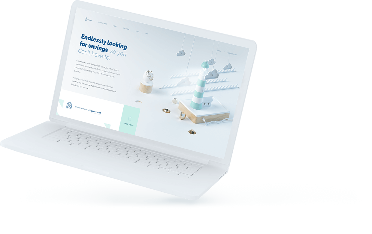
Our Dashly palette - arrayed steely blues and crisp white expanses - were carefully chosen to elicit trust and confidence in our services. Blue traditionally communicates stability and calm. Though a popular choice for financial service marketing, it’s often cluttered with stock photos, percentages, and promises.
We opted for pure white expanses with spare text to communicate our confidence that the service represents itself - we don’t need to push or overwhelm customers to prove our value.
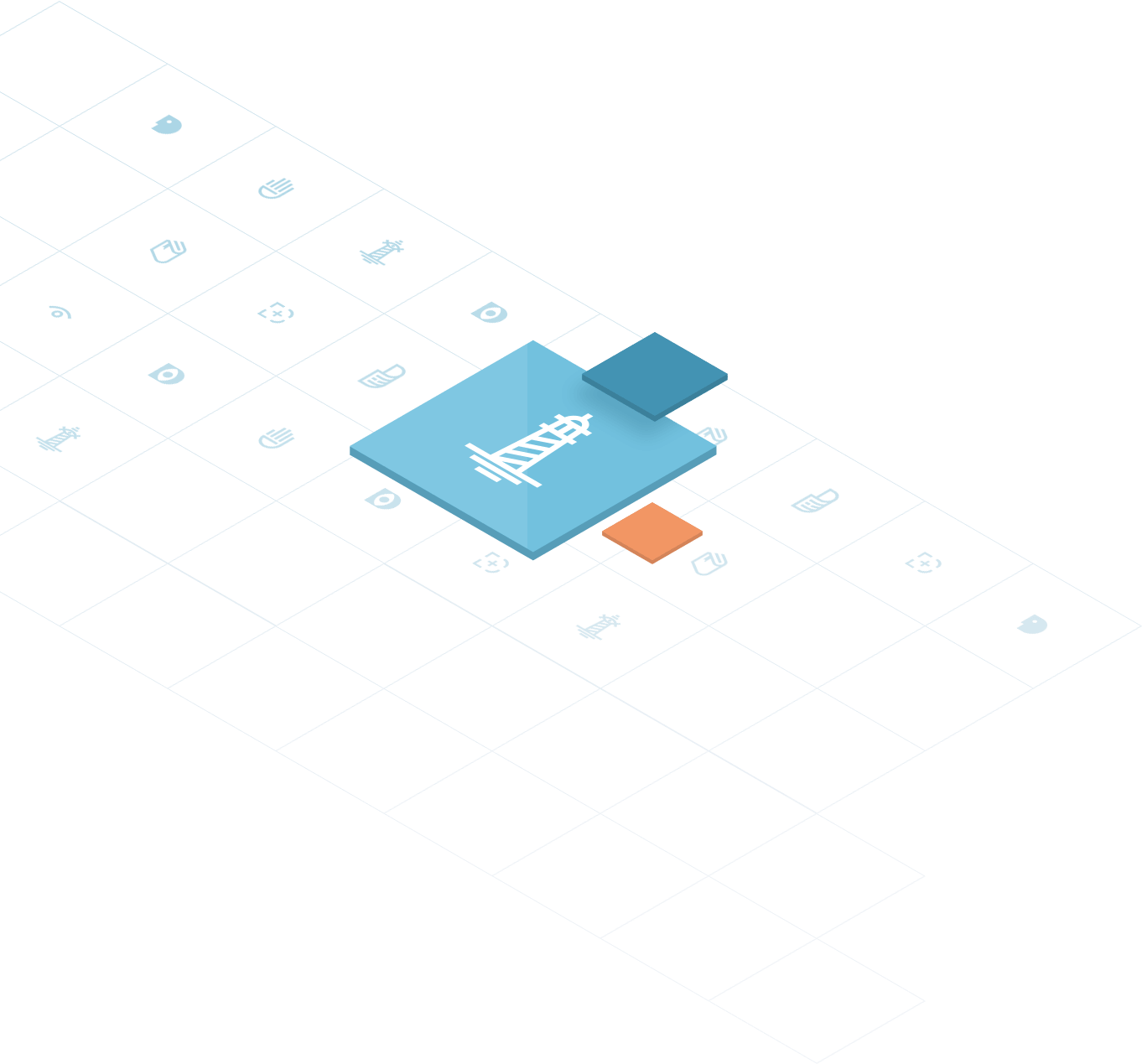
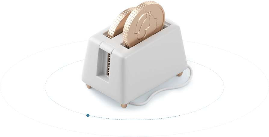
Forget the stock photos and tired illustrations of fancy houses or middle-aged families buying groceries with the money they saved. We chose a different route, with detailed, digitally-delicious 3D animations that are:
- Clever - Every image illustrates an aspect of Dashly’s values
- Quirky - Dashly is a different kind of mortgage management tool
- Detailed - Just because Dashly simplifies doesn’t mean a sacrifice of quality
- Animated - Our images never stop moving, just as Dashly never stops comparing
- Streamlined - Only what is effective. Only what is productive. Only what is valuable.
The only purpose of a website is to convert browsers to buyers. And - if possible - with almost zero effort on the customer’s part.
Our team haggled, nitpicked, and debated over the placement of every menu, slide, form, chart, and animation until we felt that customers could effortlessly read, navigate, sign-up, monitor, and purchase Dashly’s services and products. If it didn’t feel 100% natural, we didn’t include it.
User Interactions
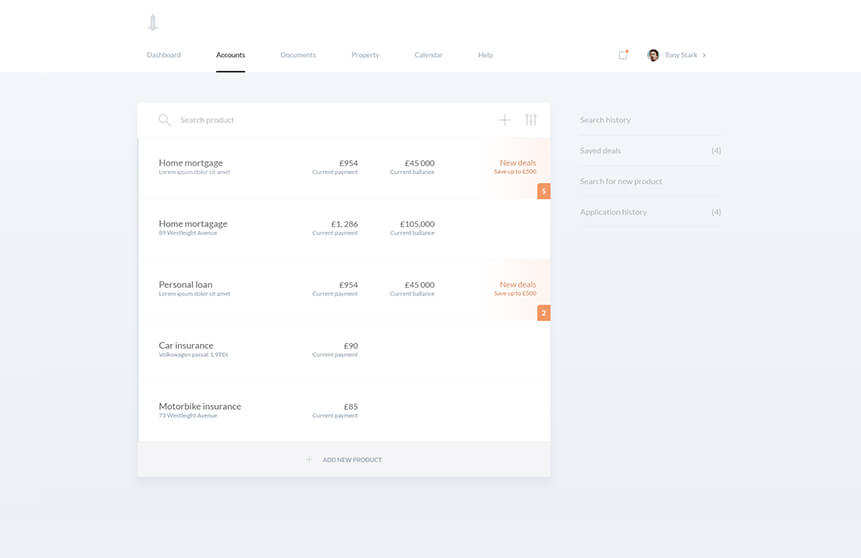
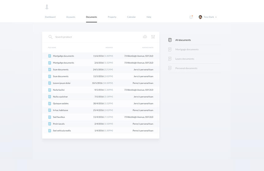
To net a wider range of clients we created multiple web portals linking Dashly to the world, maximizing our presence through social media posts, magazines, and finance hubs. Essential information is available at a glance, with more detailed information accessible by a mere mouse-hover.
No one likes dealing with their mortgage, so our platform combines hassle-free navigation and easy input forms for skittish mortgage holders.
Relying on transitions and hovers, we developed Dashly’s layout to provide abundant, accessible information with notably less clicking and searching than other financial websites.
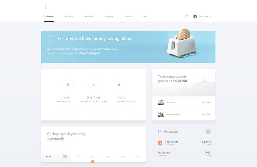
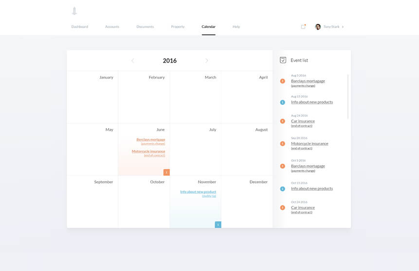
Monitoring a mortgage is as easy as checking Instagram with our in-house mobile app. It features a camera with document scan, touch screen functions, minimalist drop-down menus, and clutter-free design. We placed the app navigation bar at the screen’s base so customers need only move their thumb a few millimeters to effortlessly review multiple pages.
Top bar with
contextual menu
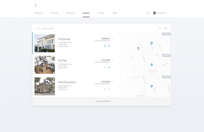
List of properties
Nav bar
Onboard new users
03
No one enjoys filling out financial forms, so we streamlined the process from discovery to sign-up. We developed, tested, reviewed, and selected the most efficient customer input forms to make conversion as speedy and painless as possible.
-
Man hours
-
App screens
-
Interactions
-
3D works
-
Design briefs